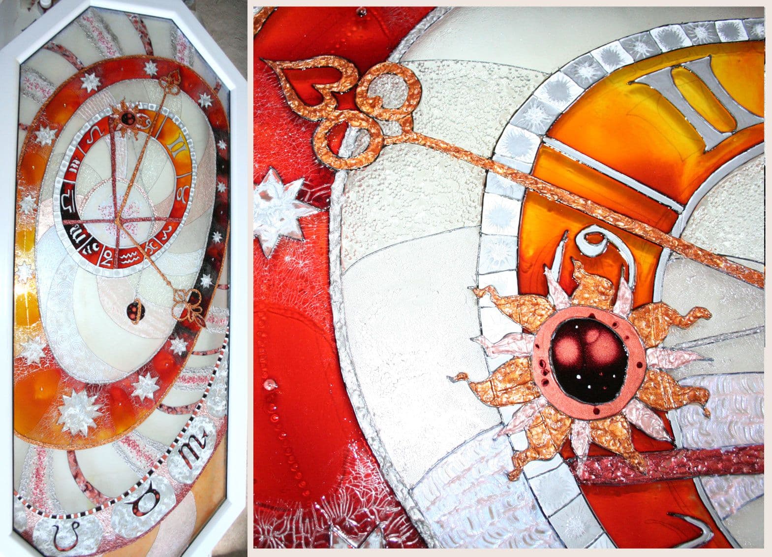
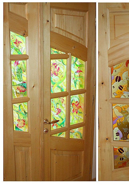
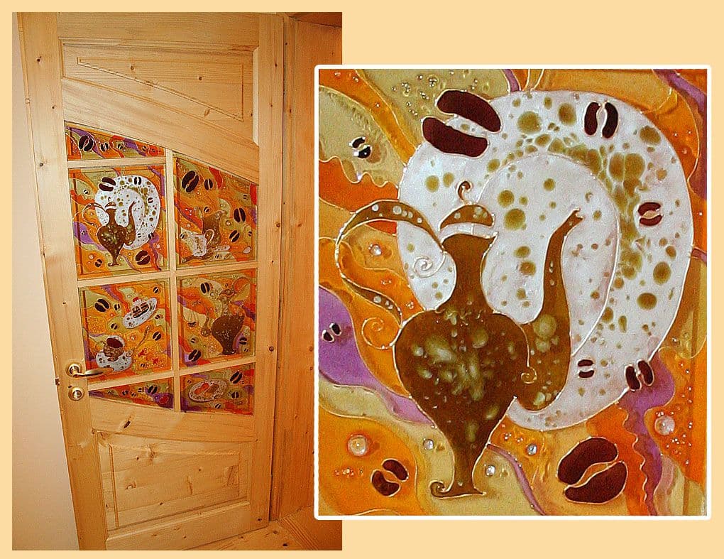
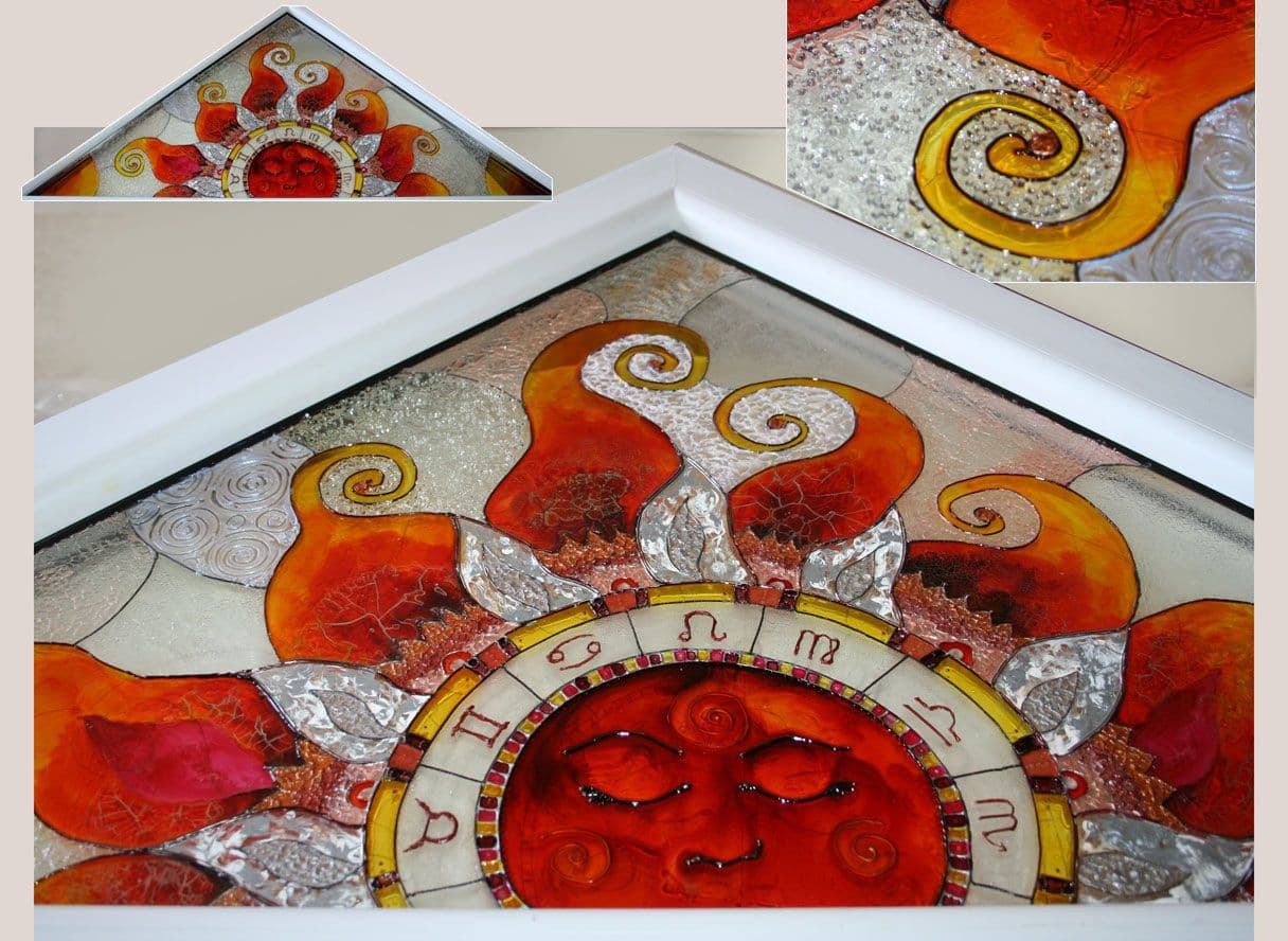
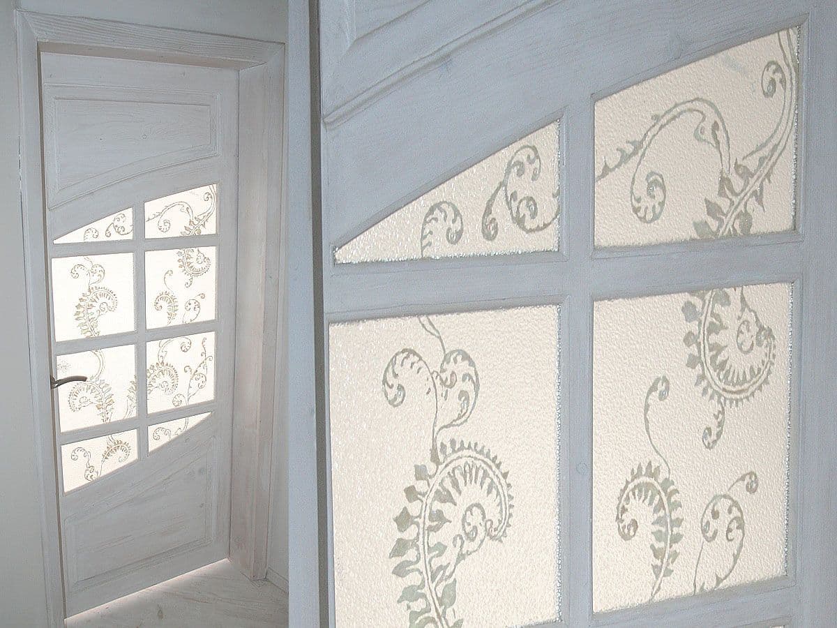
Pseudo stained glass is a refined decorative art technique that transforms doors, windows, and interior objects into luminous design features. Created with special transparent paints, this approach allows light to pass through the surface, filling the room with colour and creating a soft, fairytale-like atmosphere within the interior. When daylight moves through the painted surface, the colours come alive, subtly shifting throughout the day and enhancing the emotional quality of the space.
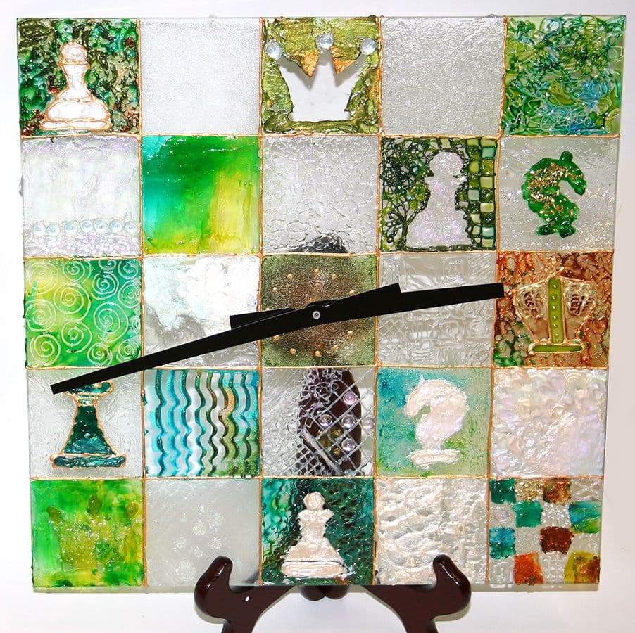
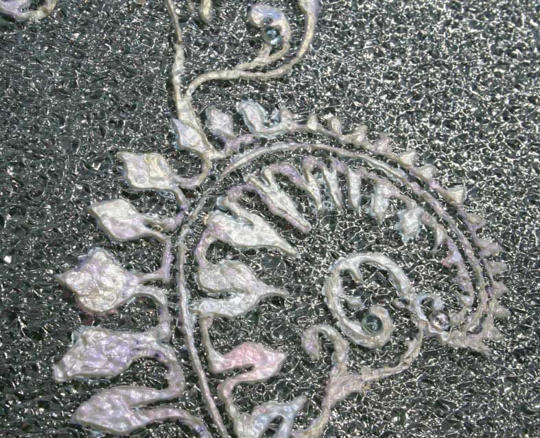
One of the key advantages of pseudo stained glass is its ability to match and enhance the existing interior style. From soft, minimal colour schemes to more expressive, ornamental designs, each piece is created in dialogue with the architecture, materials, and colour palette of the room. The artwork becomes an integrated part of the interior rather than a separate decorative element.
Pseudo stained glass works beautifully as an accent feature or as a focal point, adding depth, warmth, and a sense of wonder. It is particularly effective in spaces where natural light plays an important role, turning everyday architectural elements into sources of colour and atmosphere.
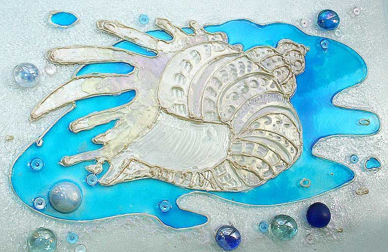
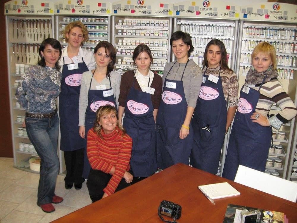
Knowing your tools deeply — how they behave, how they age, how they respond to light and heat — changes the way you work and the confidence with which you make decisions. During my time at Azur Studio in Kyiv, we took part in a number of art trips across Europe, visiting paint and medium manufacturers directly. These experiences were invaluable. Being able to ask questions about materials from the people who created them — the chemists, designers, and technicians behind the products — gave us insights no manual or catalogue ever could. Who could know the materials better than those who developed them? Along the way, we also participated in workshops with local designers who introduced us to the full potential of different gels and pastes, transparent and opaque paints, and specialised products for textile decoration and pseudo stained glass. We explored techniques for creating patina, working with gilding, and layering surfaces in ways that expanded both technical knowledge and creative possibility. I often find myself missing those times — being surrounded by like-minded professionals, travelling, learning, experimenting, and talking endlessly about what we loved most: paint, surface, and decoration. Those journeys shaped not only my technical approach, but also my respect for materials as active partners in the creative process.
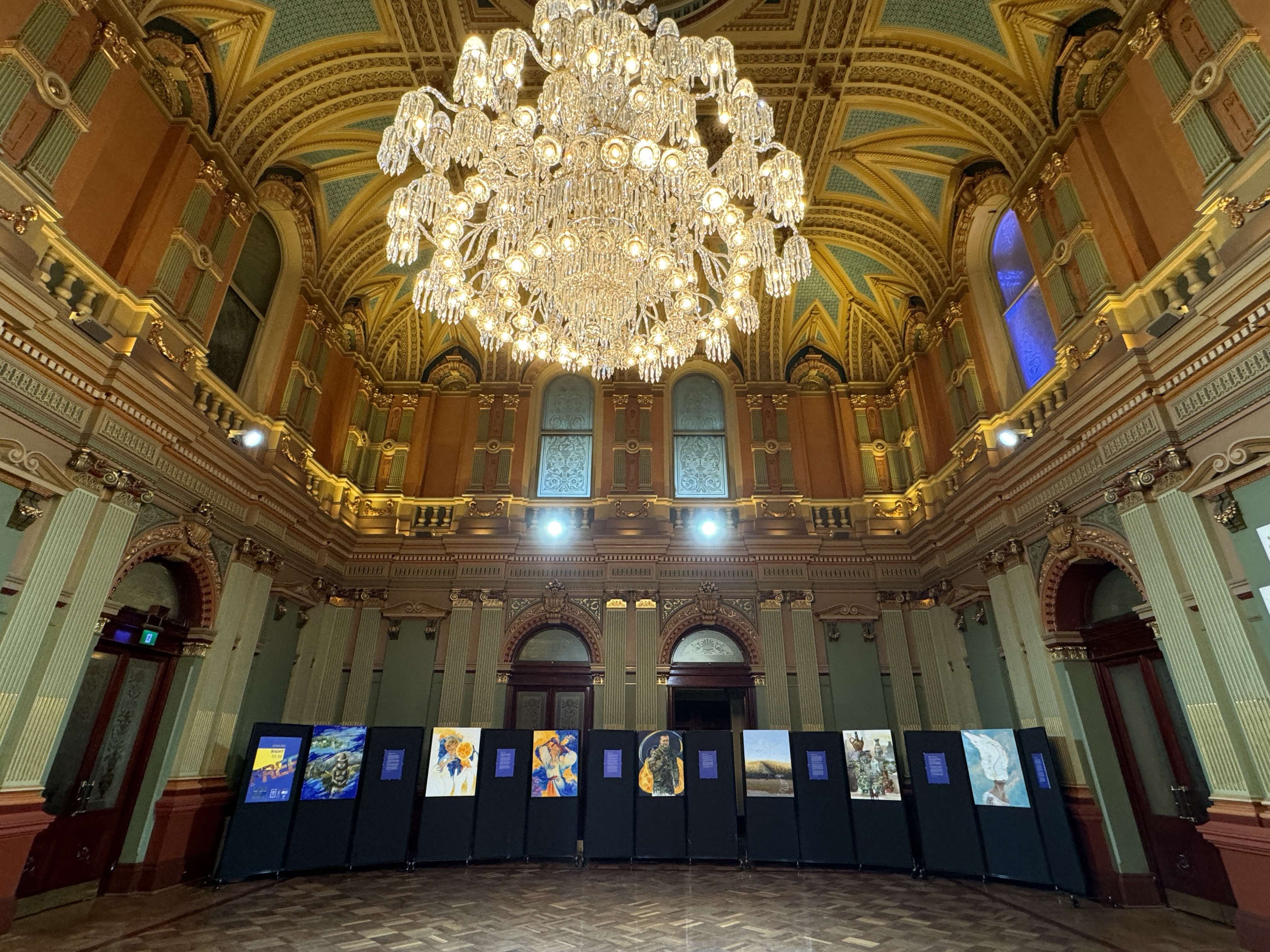
Right to Be Free was an art exhibition by True Blue & a Little Bit of Yellow, created to mark Ukraine’s Independence Day and presented as part of the Freedom. Courage. Culture. performance at Sydney Town Hall in August 2024. The exhibition focused on fundamental human rights and freedoms — values currently under severe threat in Ukraine due to the unlawful Russian invasion. The visual artworks deliberately reflected the joyful, life-affirming aspects of freedom, while accompanying posters addressed the specific rights being violated. This contrast invited viewers to reflect on what freedom means, and what is at stake when it is taken away. Presented in the heart of Sydney, the exhibition formed part of a broader cultural program celebrating Ukrainian identity, resilience, and independence.